CoinDesk
CoinDesk Homepage Redesign
Redesign the homepage of the news media site to improve user experience and enhance user engagement

Brief
CoinDesk is a news media site that creates articles and multimedia content specializing in bitcoin and digital currencies. It has more than 20 million users.
However, the current design of the homepage failed to entice users to discover more content on the page. This does not align with the mission of a content creation company.
The goal of the homepage redesign is to drive more traffic to the content pages and improve user experience while balancing needs from multiple stakeholders.
My redesign has been implemented and launched in July 2021. You may see the new design in live here.

Impact
I led the redesign of the homepage, which resulted in increased engagement and a higher user adoption rate.

Challenge
The current data
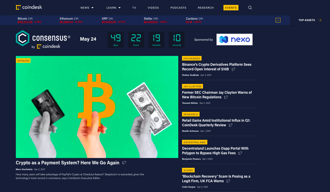
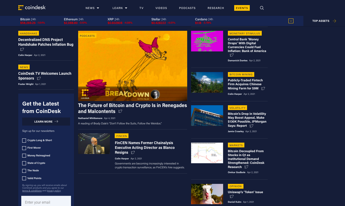
The homepage is a gateway for individual and institutional investors and stakeholders to access the price and article pages. However, the data shows that the homepage failed to entice users to discover the content and click through.

The experience
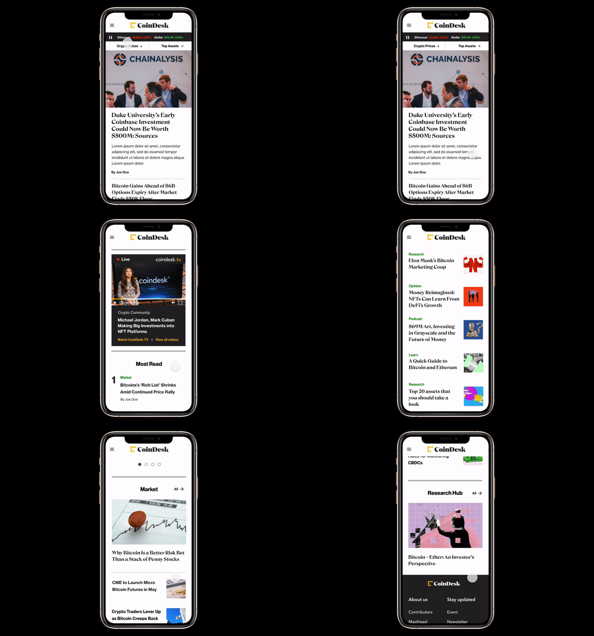
The current website has severe usability problems that make it challenging for visitors to achieve their tasks quickly and accurately. Some major usability issues were:
Disorganized and clutter content
Confusing IA and navigation
Lack of hierarchy and inconsistent design elements
Leaderboard (above the fold)
Leaderboard (Under the fold)
Other board


Business needs
The homepage is not solely owned by the product team, the editorial, TV, and podcast teams also have partial ownership on it. Thus, the homepage needs to show varied content from different stakeholders yet not to overwhelm users, which means balancing needs and making trade-offs are essential.
Besides, the company wants to show a hustle and busy vibe, while being clean and easy to navigate.This “contradictory” requirement is also a design challenge.
Goals of redesign

Discover
User needs
CoinDesk targets to two types of users. Individual/Institutional investors and stakeholders. Understanding users needs will help us to determine which content should sit on the homepage, and how to help them achieve their goal quickly and easily.


Usability issues
To define the pain points of current homepage, I conducted testing sessions to uncover the usability issues. I tested 16 people on desktop and mobile by using usertesting.com. This helps me to understand user behaviors and obstacles that keep them away from achieving user goals.

Ideation session
We held a zoom ideation session with key stakeholders to present my findings, listen to their needs, and have them brainstorm about what features and content should sit on the homepage. It was the first time that stakeholders participated in the ideation exercise together. It went really well.

Design
Final design
Before

After

Design decisions
Single Navigation Bar
Since users had issues finding information under the navigation bar, I simplified the bar by removing the secondary drop down menu and grouping content effectively. To validate it, I conducted card sorting with a group of participants and asked them to organize tabs that made the most sense to them
Before

After

Price Bar
The current site has a drop down menu to show the cryptocurrency prices overview. However, most of users wanted the prices to be filtered out so they can see it efficiently. Besides, users had issues spotting the “top asset” button.
In the new design, I removed the arrow, created an interactive data chart to show the prices of top ranking assets, and placed a button that links to a page of the prices overview so users can filter it. I also placed the “top asset” button in a noticeable spot.
Before

After

Section Header
To build a better visual hierarchy to help users navigate the page easily, I added the section header at each column, so users know where they are and what they are looking at.
Before

After

Labeling
The yellow labels at current site are meaning multiple types of things that confuse users. I re-categorized it and placed the green label above the article’s headline to indicate the section that the article comes from. When clicking on, users will be able to see the articles under that section.
Before

After

Event and Newsletter Banner
The current placement spot of the promotion will look overwhelming if the breaking news banner and ad banner comes up altogether. The newsletter widget is not noticeable and the signup flow is counterintuitive.
In the new design, I re-placed the event banner to save space while also standing out. For the newsletter, I suggested using a shining banner instead of a widget to make it stand out. The users could click through to learn more and sign up.
Before (Event Banner)

After (Event Banner)

Before (Newsletter)

After (Newsletter)

Introducing the feature of live update, trending news and most read
According to user interview, most users want to read the latest news and want to know what everybody is reading and what is trending so they can stay updated and gain insights for making investment decisions. In the new design, I have some dedicated spots for these features. Users can also filter content at the trending news section.

The leaderboard shows varied content from different stakeholders
To meet the business requirements, I made sure to design the modules to show varied content on the homepage. There is a sticky TV player that will follow with the users when scrolling, and there are two buttons that users can select to watch live streaming or other videos. There is also a carousel where users can see and listen to the podcast.

Constraint
The ad placement is important for both the design and business. The current ad placement on the homepage takes a lot of space and also disturbs user experience. I took an initiative to make a new rule of ad placement and redesigned it to ensure the ad will not only bring revenue but also not disturb the user experience.
Before

After - High impact ad

After - Banner ad

Final design


Evaluation
User testing
In total, I went through three rounds of testing. The second and third round were held after iterating the design. In the final round, I tested 8 people in total.
